|
User Interface Overview |

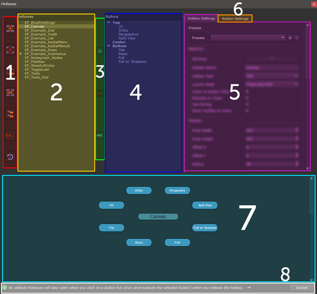
The Hotbox Creation Toolbar is the way to interact with a selected Hotbox in the Hotbox List (2) or create a new one
- Create a new Hotbox

To create a new Hotbox or Marking Menu click this Button.
A dialog will ask you to name the newly created Hotbox
|
|
Each Hotbox Name needs to be unique |
- Delete selected Hotbox

Deletes the Hotbox currently selected in the Hotbox List (2)
- Create Submenu Hotbox
Creates a Child Hotbox ('Submenu') for the currently selected Hotbox.
Submenu Hotboxes can be linked to a button, resulting in a new Hotbox to launch once the Button is executed.
|
|
A submenu cannot have another submenu |
Example of a Submenu attached to a Button

- Rename selected Hotbox

Rename the Hotbox or Hotbox Submenu selected in the Hotbox List (2).
- Duplicate selected Hotbox

Duplicate the Hotbox or Hotbox Submenu selected in the Hotbox List (2).
- Open Hotbox Folders in Explorer

Opens the save location of Hotboxes in a File Explorer.
- Hotboxes are saved in the same location as your Mari Settings File.
- Each Hotbox has its own Folder
- Sharing Hotboxes between Artists is easily achieved by copy / pasting a Hotbox Folder
- Reset selected Extension Pack Hotbox to Default

If the Hotbox selected in the Hotbox List (2) is a default Extension Pack Hotbox or Hotbox Example,
this allows you to reset it to its initial installation state
The Hotbox List displays all installed Hotboxes. Each Hotbox corresponds to a Folder on Disc.
|
|
Hotboxes are saved in the same folder as your mari config file. Press Button
to open the folder in the File Explorer
|
With a Hotbox selected in the Hotbox List (2), you can add, remove or rename Buttons
- Add new Button

Add a new Button to the currently selected Hotbox.
A dialog will open asking for a name of the Button.
|
|
|
- Remove selected Button

With a button selected in the Button List (4), you can delete a button.
|
|
Deleting a Button can't be undone |
- Rename selected Button

With a button selected in the Button List (4), you can rename a button
|
|
|
The Button List displays all Buttons within the currently selected Hotbox (2).
The Button List is separated into 3 placement areas:
- Top
- Middle
- Bottom
Depending on the Type of Hotbox each Section can display different amounts of Buttons.
You can create any number of Buttons but not all of them might be visible.
|
|
|
|
5 - Hotbox Settings |
The Hotbox Settings Tab displays the global Settings of the currently selected Hotbox (2) such as
- Shortcut
- Hotbox Type (Rowbased Hotbox, Radial or Dial)
- Button Sizes, Shapes and Colors
- Positioning of items
- Backdrops
- etc.
|
|
Global Color, Shape and Size of Buttons can be overridden per Button |
For detailed information about the Hotbox Settings please visit this topic:
With a Button selected in the Button List (4), this Tab allows configuring a Button
- Name of Button
- Functionality
- Visibility
- Positioning (Top,Center,Bottom Row as well as position within Row)
- Style of Button
|
|
Color, Shape and Size of Buttons can be overridden per Button |
For detailed information about the Button Settings please visit this topic:
With a Hotbox selected in the Hotbox List (2), this shows you the preview of how the Hotbox will appear to you.
|
|
Clicking on a Hotbox Button in the Preview Area will not have any effect |
- Tips Area

The Tips area displays a random hint on each dialog launch.
You can also cycle through all tips by pressing the arrow button on its right.
- Accept Dialog

In order to apply changes to a Hotkey the Dialog needs to be accepted and closed however
changes made directly to buttons are saved instantly
|
|
Changes made to Buttons and Settings are saved instantly without the need to Accept the dialog |

