|
General Hotbox Settings |
The Hotbox Settings Tab displays the global Settings of the currently selected Hotbox such as
- Shortcut
- Hotbox Type (Rowbased Hotbox, Radial or Dial)
- Button Sizes, Shapes and Colors
- Positioning of items
- Backdrops
- etc.
The available detail options change depending on the choice of Hotbox Type however the below options are global to all Types.
|
Presets |
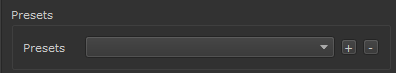
The Preset Section allows you to store and recall Hotbox Settings.
All available Settings are saved
|
Behavior |
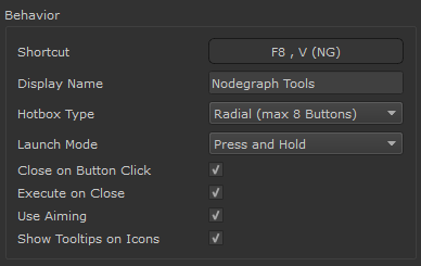
- Shortcut
|
|
'Nodegraph Only' Shortcuts Nodegraph only shortcuts that can be configured via this dialog are only available in Mari 4.6v4 or higher. In previous Versions Nodegraph Shortcuts need to be manually configured via the standard Mari Shortcut Editor |
Set the Shortcut for the currently selected Hotbox
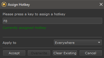
If a conflict is detected you have the option to force-ably overwrite the assignment
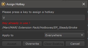
If you are using Mari 4.6v4 or higher you can change to Context the Hotkey applies to from Everywhere to Nodegraph Only
to define Hotkeys that only have an effect in the Nodegraph

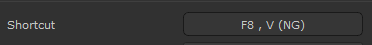
The Shortcut Field in the Hotbox Options displays a Nodegraph Only Shortcut appended with a '(NG)'
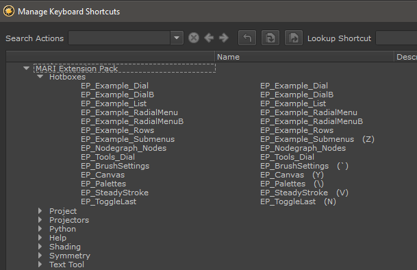
Hotbox Hotkeys can also be defined via the Mari Shortcut Editor available in the Main Window's Edit Menu.
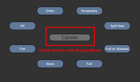
- Display Name
The Display Name is the text shown in the center of a Hotbox if the Center Button is visible
- Hotbox Type
The Hotbox Type determines the basic shape, distribution and available options of a Hotbox
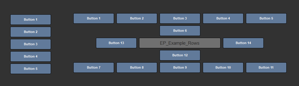
- Row Based
Two separate examples of Row Based Hotboxes. The first one has its Center Button hidden.
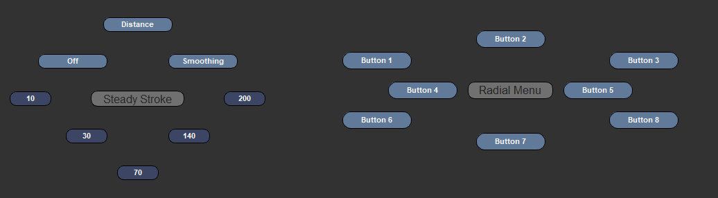
Two separate examples of Radial Hotboxes. Radial Hotboxes can have a maximum of 8 Buttons.
The second one uses a Radial Indent on the Center Buttons.
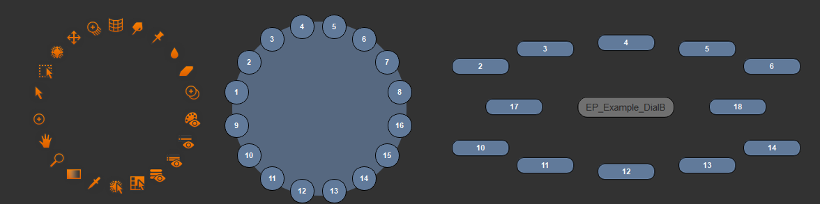
- Dial
Three separate examples of Dial Hotboxes. The first two have their Center Buttons hidden
The second one has a backdrop, the third one has a squash factor and custom button positioning.
- Launch Mode
The Launch Mode determines how the Hotbox reacts to being launched by a Shortcut
- Single Tap
After having been launched via a Hotkey, the Hotbox will stay open even if the Hotkey is released
It will close once
- a button has been clicked (if Close on Button Click is active)
- the right mouse button is clicked
- the hotkey or any other key is pressed
- Press and Hold
After having been launched via a Hotkey, the Hotbox will stay open as long as the Hotkey is pressed down
- Close on Button click
When on, a click on a button automatically closes the Hotbox.
When off, the Hotbox will say open until
- the right mouse button is clicked
- In Press and Hold Launch Mode: The Hotkey is released
- In Single Tap Launch Mode: A key is pressed
|
|
The advantage of this mode is that it allows execution of multiple actions within a hotbox without the need to reopen the hotbox every time |
When on, any button that is marked active is automatically executed as soon as the Hotbox closes even if the user didn't click a mouse button
This works especially well with the Use Aiming setting to rapidly execute a button without being very precise in clicking on the button
- Maintain Positions
When on, adding a new button will not affect the position of existing buttons to aid with Muscle Memory
|
|
Maintain Positions is only available in Row Based and Radial Mode |
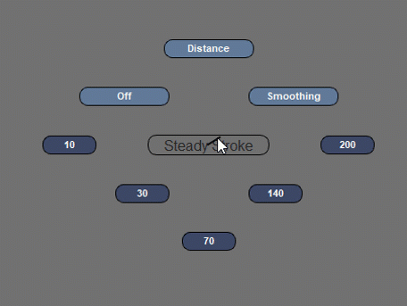
Aiming draws a virtual line from the center of the Hotbox through your cursor. Any button closest to the Cursor is marked active.
This works especially well with the Execute on close setting to rapidly execute a button without being very precise in clicking on the button
|
|
Currently the Aiming Line terminates at the Bounding Box of the Marking Menu. |
Example of Aiming. Buttons become active without being directly
touched by the cursor
- Show Tooltips on Icons
If Buttons are only displayed as icons and this setting is turned on, a Tooltip appears with the Button Label/Name when the Mouse hovers over the Icon.
|
|
In densely populated Marking Menus with many options, having this setting on can lead to 'Tooltip Spamming' on some Linux Operating Systems, where multiple tooltips are visible at the same time when the user moves the mouse very fast |
PREVIOUS PAGE: Hotbox Settings
NEXT PAGE: Row Based Hotbox Types